Ukelele
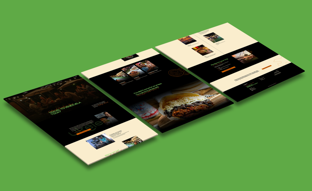
For the Ukelele Foods website, the client provided the original desktop design, and my role was to implement the design accurately while creating a fully responsive mobile experience. I translated the supplied visuals into a functional, production-ready website, ensuring the desktop layout matched the approved design specifications.
A key focus of the project was adapting the desktop design for mobile devices. This included restructuring layouts, adjusting spacing and typography, and optimizing interactions to ensure usability and visual consistency across screen sizes.
The site was built to perform smoothly across devices, with careful attention to responsiveness, layout integrity, and overall user experience. The final result is a polished, scalable website that preserves the client’s design vision while delivering a seamless experience on both desktop and mobile.