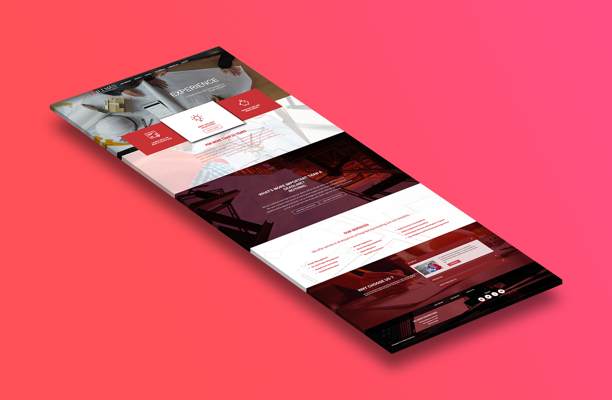
Hillman
For the Hillman website, my focus was on creating a clean, modern, and professional digital presence that reflects the company’s identity and services. I worked on building a layout that feels organized and easy to navigate, while highlighting key information in a clear way. This included planning the structure of the site, developing the visual design, and ensuring that each section communicates value to visitors.
As part of the project, I made sure the website performs smoothly across devices. I tested the pages, checked for loading issues, and reviewed the overall user experience to keep everything working correctly. Visual consistency was also a priority, making sure the colors, typography, and imagery align with the brand.
With the finished Hillman site, the goal is to give users a confident first impression and quick access to essential details. The site presents the company’s expertise, services, and contact information in a straightforward format, helping visitors learn more and take action with ease.